I'm Alan Dorow, a managing partner in SiteWelder. When Mason Miller and I started SiteWelder twenty years ago, we wanted to create an online platform for photographers and artists. Creatives would be able to display and share their work with a newly connected world. I previously worked as a photographer and designer and Mason was a musician and expert coder. Since then, we've enabled thousands of visual artists to tell their stories through a powerful online interface.
When we started, technology was limited. Online connection speeds were painfully slow. Images needed to be small enough to download faster than an average turtle. But technology and infrastructure developed quickly. People started using DSL and then high-speed cable and fiber optic connections. We created new designs that enabled larger image display and a better viewer experience.
At the time, it seemed like an interesting and impractical tool. No keypad, no cursor! Who would use this kind of device?
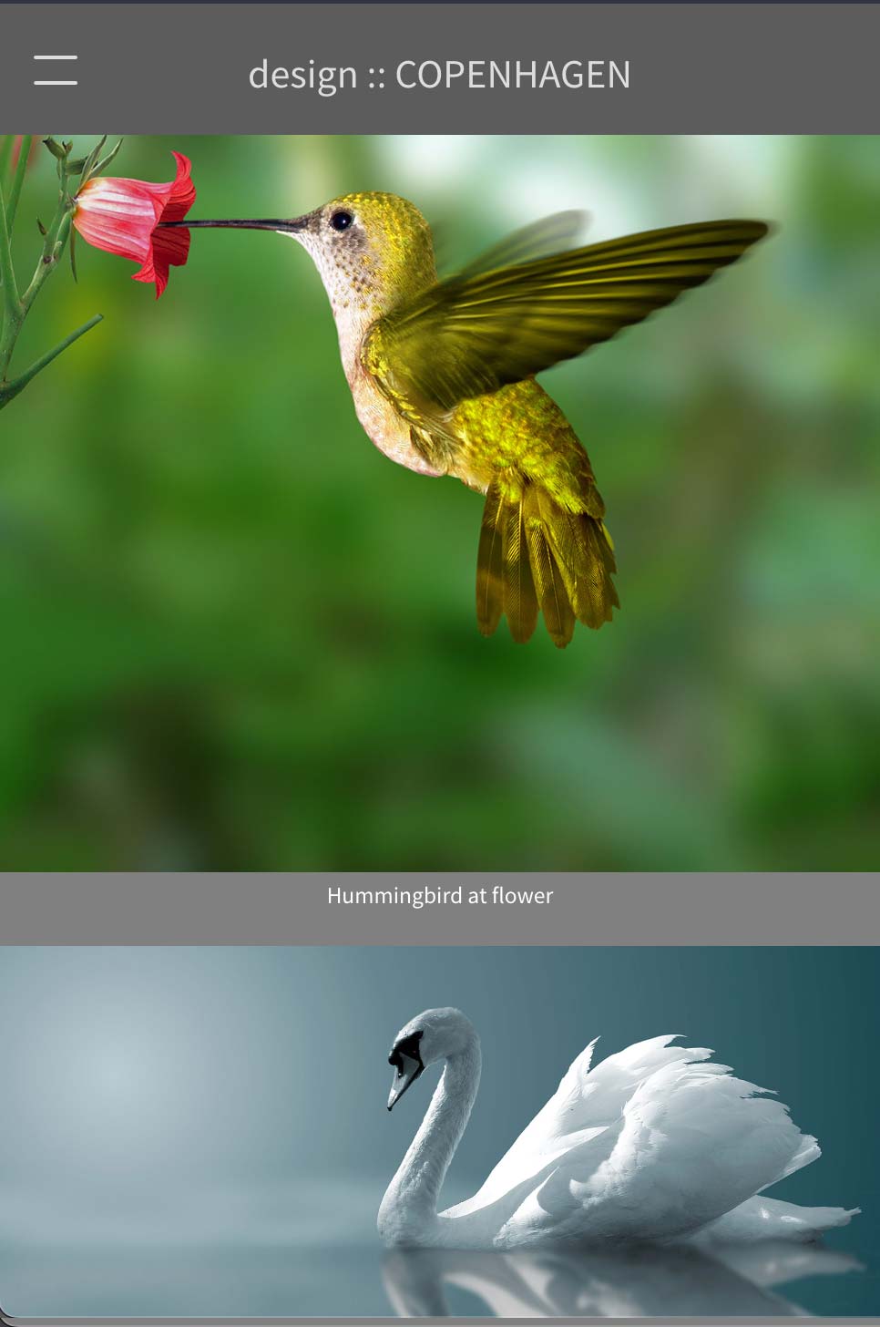
But 16 years later, the smartphone is embedded in most of our lives. People now view their phones more than the faces around them. Social media is ubiquitous, photos are easily shared and web sites are more likely viewed on mobile devices than desktop monitors.
If you use a design like Prague or Palo Alto, for example, it displays beautifully on a desktop monitor. For mobile, however, we suggest you use one our three "Mobile" options.
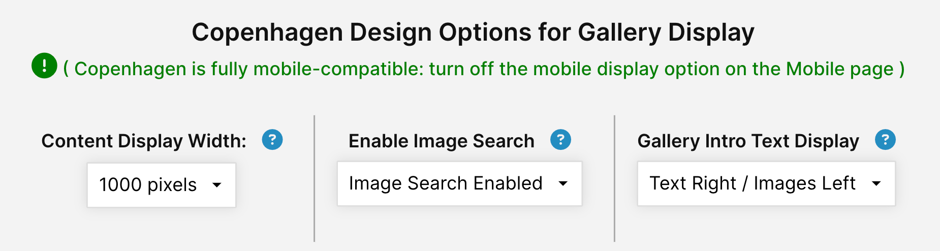
Also included is an image search option. A subtle search area appears on the top of your pages - searching will look through your captions and gallery names.
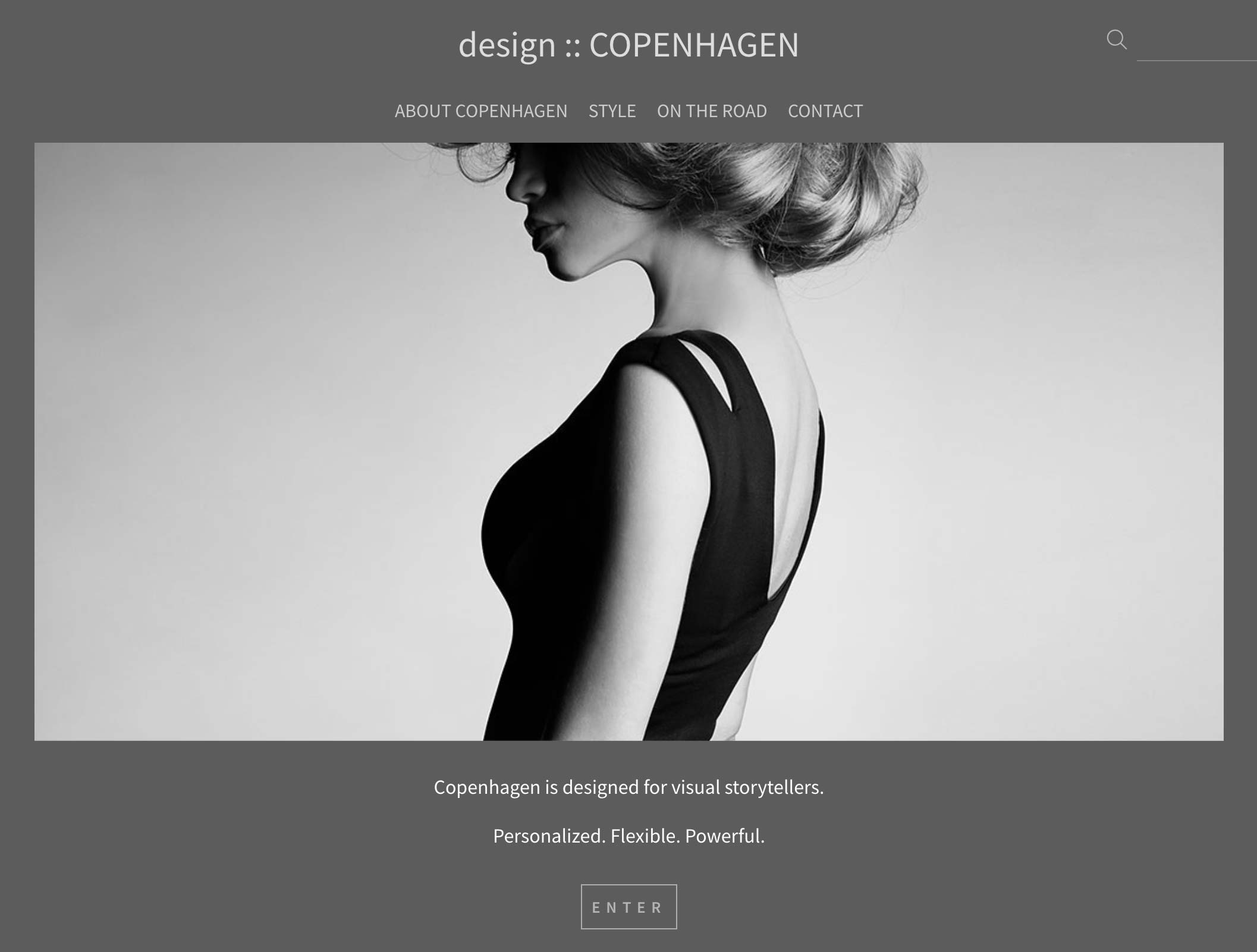
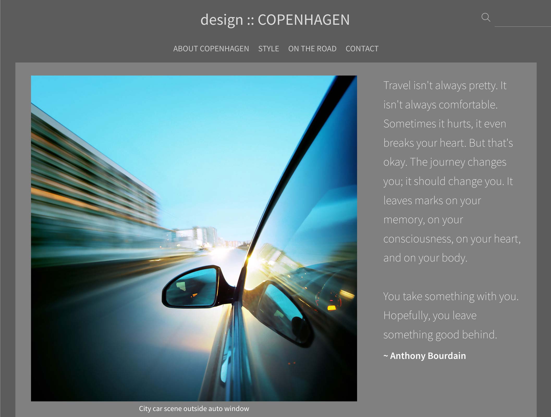
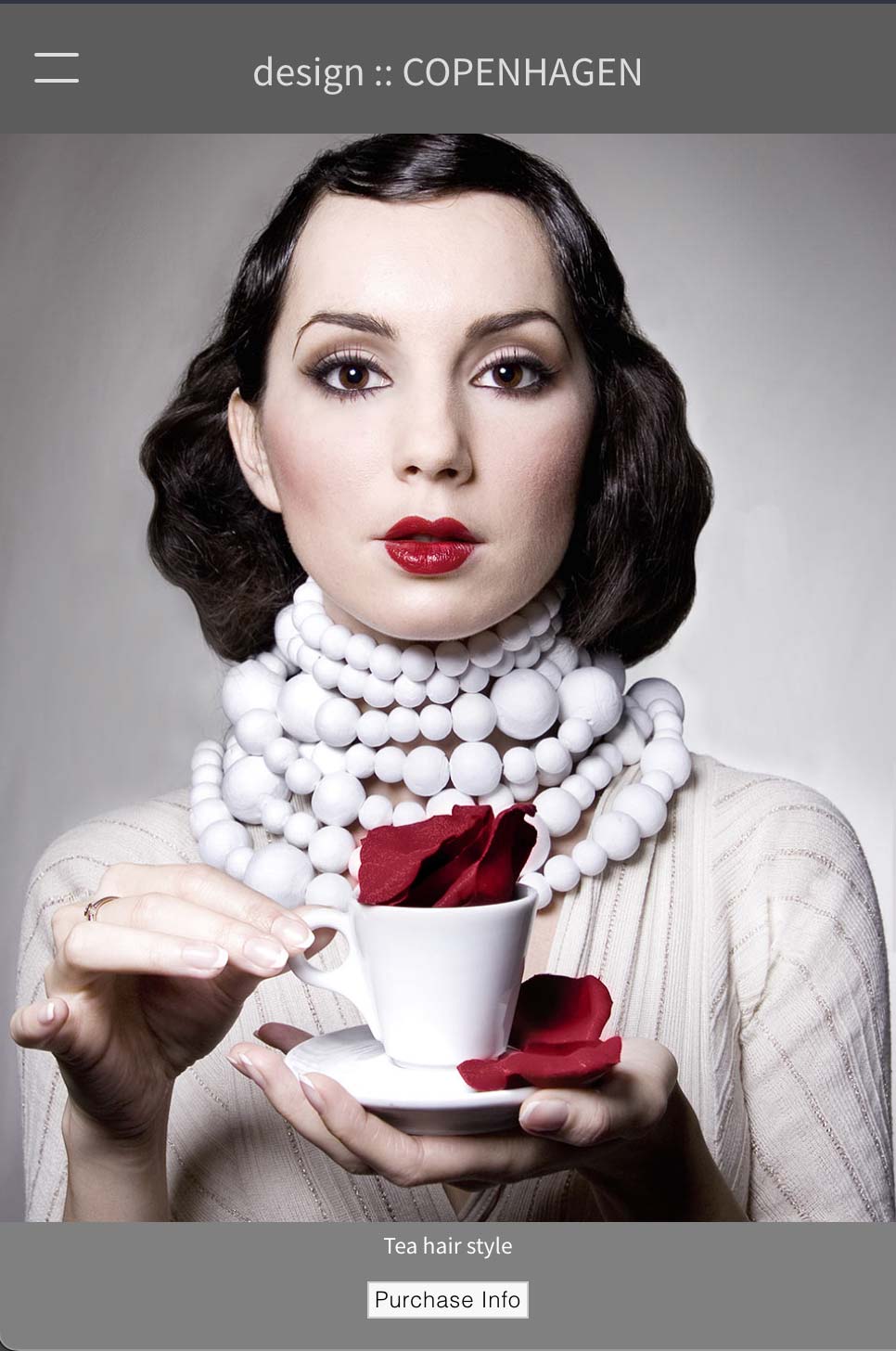
We recently added a nifty feature that lets you choose the image display width in your galleries. With Copenhagen, images display in a vertically-scrolling area. If your display area is wide, it can make the image heights appear quite deep on the page. Constraining the content display width to a narrower width (as narrow as 750 pixels) can give you a nicer display, depending on your content.
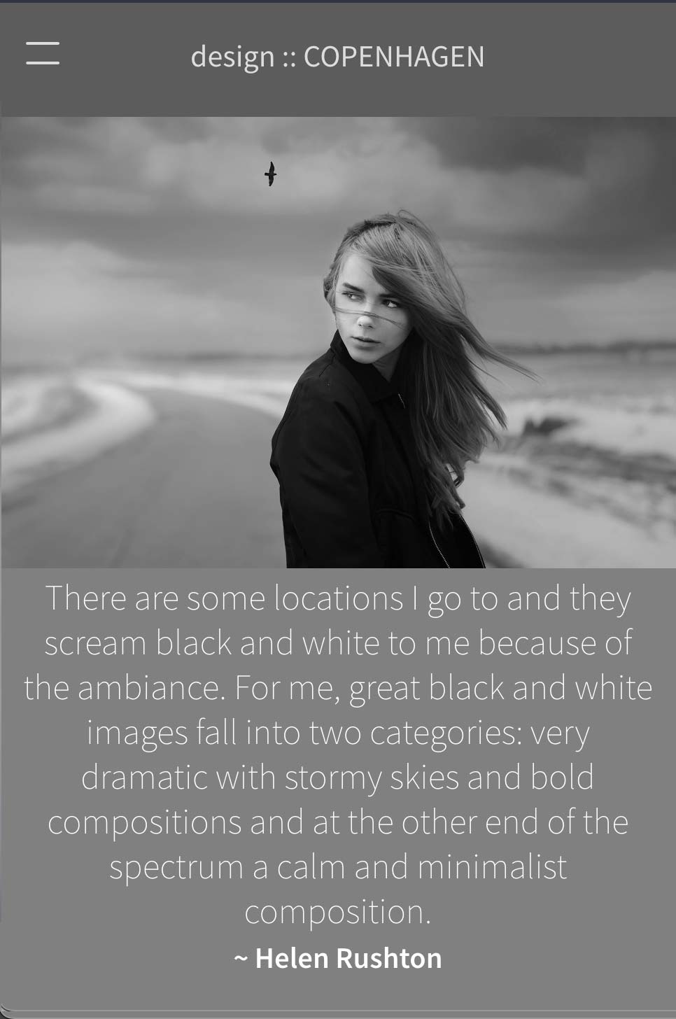
Our latest feature is an option to display gallery introductory text on the left, right or top of your gallery images. Your gallery text maintains it position towards the top of the page as you scroll down through the images. On mobile, the gallery intro text displays above the images automatically. All of these options can be found in our SiteManager in the Designs section / Copenhagen.